Brand Elements

Primary brandmark

Our primary brandmark is in purple, black, and white. It always appears as a banner design with the term ‘FRONTLINE NEGOTIATIONS’ in the top sections and our organization’s name, ‘CENTRE OF COMPETENCE ON HUMANITARIAN NEGOTIATIONS’ as a subtitle in the section below.

The brandmark artwork should always be used as supplied and should never be recreated.

The primary brandmark for use on light-coloured and white backgrounds have a purple upper section and black outlines. If displaying the brandmark on a dark-coloured, purple, or black background, the primary brandmark with the white outlines should be used.

The black and white version of the primary brandmark is only applied in the case of producing black and white collaterals.

Primary brandmark placement

The primary brandmark should always be positioned on the right-hand side of the page or screen.

The default position for the brandmark on reports covers, presentations, brochures, etc. is the bottom right.

When presenting the primary brandmark on collateral that has technical limitations, or it is necessary to feature the branding at the top of the page or screen for visibility (such as pull-up banners or web pages), or if there is/are (an)other organisation’s brandmark(s), then it is acceptable to position the brandmark top right.

Secondary brandmark

We have a simplified version of the brandmark which is the term ‘FRONTLINE NEGOTIATIONS’. It represents our core work with our Community of Practice.

This version of the brandmark should not replace the primary brandmark when displayed prominently, such as in official and formal communication materials and promotional collateral.

The exception to the rule is that this secondary brandmark can replace the primary brandmark on merchandises such as T-shirts, jackets, bags, pens, etc.

Please see our Merchandise section (page 28) for further details.

The black and white version of the secondary brandmark is only applied in the case of producing black and white collaterals.

Clearspace and minimum size

It is important to ensure both brandmarks are clearly identifiable and readable. We avoid not making them too small, nor being too crowded with (an)other organization’s brandmark(s) and page elements.

Please use the guide on the right to ensure minimum clearspace around all sides of the primary brandmark, and ensure both brandmarks are never smaller than 30 mm width (primary brandmark) or 20 mm width (secondary brandmark).

Clearspace

30 mm minimum size

20 mm minimum size

Requesting Access

To request access to download and use our logo, please submit the mandatory form. 

We created a hand-drawn graphic of our brand signature for use as a supporting element in layout design. This illustration reflects the hands-on approach to humanitarian negotiation and capacity building, as well as represents the convergence of our Community of Practice, their experiences, and interests into a common goal.

We dominantly use this brand signature in its entirety, when possible. Otherwise, in a section when stumbling on technical difficulties.

We use it as the main feature (for example on report covers or in animation), or as a watermark or textural background, to avoid unofficial replication and fraudulence of our communication collateral.

Mind not to become repetitive when using this device — please use it sparingly. The hand-drawn nature of the ‘convergence illustration’ can also be reflected in other ways using hand-drawn underlines, circles, or arrows to emphasize messages, and icons drawn in the same style.

Our colours are carefully considered to clearly identify CCHN and ensure our visibility among other organizations in the humanitarian sphere. Please see our brand book for colour breakdowns.


Primary Colours

Deep Purple

#6D4491
R109/G68/B145
C63/M83/Y0/K10
PMS Medium Purple

Dark Grey

#434243
R67/G67/B67
C0/M0/Y0/K90
PMS Neutral Black

Teal

#56C1A7
R86/G193/B167
C63/M0/Y40/K0
PMS 338

Purple

#8560A8
R133/G96/B168
C54/M71/Y0/K0
PMS 2597

Light Grey

#F1F1F1
R242/G242/B242
C0/M0/Y0/K5
PMS 649

White

#FFFFFF
R255/G255/B255
C0/M0/Y0/K0/
PMS N/A


Secondary Colours

Deep Blue

#244567
R36/G69/B103
C93/M73/Y36/K0
PMS 301

Deep Green

#008E34
R0/G142/B52
C86/M19/Y100/K6
PMS 361

Deep Orange

#F89E3E
R248/G158/B62
C0/M44/Y85/K0
PMS 143

Deep Red

#D43F41
R212/G63/B65
C11/M90/Y78/K2
PMS 186

Blue

#24578C
R36/G87/B140
C93/M70/Y20/K5
PMS 2945

Green

#00A464
R0/G164/B100
C83/M8/Y82/K0
PMS 347

Orange

#F8C34D
R248/G195/B77
C2/M24/Y80/K0
PMS 128

RED

#FC3F41
R252/G63/B65
C0/M89/Y74/K0/
PMS 485

Tints

80%

80%

80%

80%

60%

60%

60%

60%

40%

40%

40%

40%

20%

20%

20%

20%

Typography

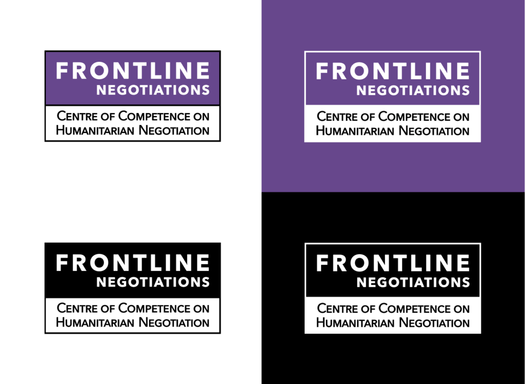
Consistent use of typography is a strong form of brand expression.

We have carefully selected fonts for use in our communications which are modern, strong, and easy to read. These fonts are both commonly used and accessible fonts that are standard on almost all computer operating systems.

Century Gothic bold is a distinctive and elegant sans-serif font that we tend to use for headings, titles, and statements.

We use Calibri for small text and body text, any large amount of text should be rendered in the Calibri font (not Century Gothic).

In the online applications, please use the following styles:

H1, H2, H3 {
font-family : ’Century Gothic’, ‘Calibri’, sans-serif; font-weight : bold;
}

Body{
font-family : ‘Calibri’, sans-serif;
font-weight : normal;
}

Substitue fonts when using Apple Keynote
When using fonts in Apple Keynote only native iOS fonts can reliably be used. In this instance please substitute Century Gothic Bold with Avenir Bold and Calibri with HelveticaNeue.

Aa

Century Gothic Bold

abcdefghijklmnopqrstuvwxyz ABCDEFGHIJKLMNOPQRSTUVWXYZ 01234567890!@#$%^&*()_+

Aa

Century Gothic Bold

abcdefghijklmnopqrstuvwxyz ABCDEFGHIJKLMNOPQRSTUVWXYZ 01234567890!@#$%^&*()_+

Heirarchy

Typography should always look great, but first and foremost it’s a functional tool. Use it to communicate, not decorate.

Use organized layouts with considered compositions and a few variations of weight. Create a clear information hierarchy — three sizes of type is a good rule of thumb.

Leaving some areas of a layout with clear white (referred to as negative) space can increase the impact of the message, and make things easier to read. If used sparingly, accent colours can be used to highlight areas of information.

Shorter headings can attract attention. Use size, weight, and colour to create contrast and guide the reader.

Employ a thoughtful use of elements — not clutter.

Uppercase Century Gothic Bold is used for all major headings. The major heading should always be purple (or reversed out of purple).

Sentence case Century Gothic Bold is used for all subheadings. Secondary colours may be used for subheadings.

Body copy should always be black, unless reversed.

Heading

Major Headings


Subheading

Subheadings should be set in Century Gothic Bold in sentence case.


Body

Lorem ipsum bur andae simodit atemper iandae labori num qui dolor sit, corio. Duci dolorem sit et exerenis erchillorum et lanis sitatib. Is reic te magniss equaspi enihic tes iuribus sequiaepel et ut aut cusandi tiaturemped ut unti offictatem. Equo velest porest ab ipsum quiatectas que enit iunt que doluptation pvel in cone sum aut faccus nus il int officae eatatatus sint.

Duci dolorem sit et exerenis erchillorum et lanis sitatib. Is reic te magniss equaspi enihic tes iuribus sequiaepel et ut aut adis doluptus auteste venis voluptibus andis abo. Gitatur iaestotatur, quam as etum et latium as cusandi tiaturemped ut unti offictatem. Equo velest porest ab ipsum quiatectas que enit iunt que doluptation pvel in cone sum aut faccus nus il int officae eatatatus sint.

Tone of Voice

Our tone of voice principles give you an understanding of what we sound like. Here you will find some tips to help you bring our voice to life, as well as some things to avoid.

Dos

Be inclusive
Adapting our discourses and discussions to the diversity of frontline negotiators, as well as group of institutions whom we work with.

Be consistent
We need to ensure a cohesive and consistent message across every communication. Our writing should feel considered and reassuring.

Be clear
Make sure your writing has a coherent point and that the key audience benefit from our works. Writing that’s easy to follow and understand instills confidence in the reader. Avoid using jargon and being ambiguous.

Be informative
Always provide accurate and up-to-date information. Become an expert in the subject. If you are unsure of the answer, let the person know that you will find out for them.

Be proactive
We are an organisation on a mission, so we never shy away from challenges or problems but will always offer steps forward and achievable goals.

Be supportive
We speak ‘on the level’ with people, offering both empathy and honest truths. We carefully consider our audience’s wants and needs, and strive to put these front and centre.

Be friendly
We strive to find common ground with our community members. A community engagement formed through a shared purpose (or even shared their anecdote from real-life experiences where appropriate) can help build trust and mutual respect.

Don’ts

Don’t be judgmental
We’re not in the position to judge any situation or context. We prefer to facilitate different contexts related to our works.

Don’t be superior
We never talk down to people or drown them in sympathy. We understand that most of people don’t want to be ‘cared for’, but prefer the support to stand on their own two feet.

Don’t be frenetic
Action isn’t about barking orders or being bossy. It’s as much about showing our own energy as inspiring others to act. Avoid exclamation marks, particularly in headings.

Don’t be cold
Getting straight to the point of dealing with important information isn’t a reason to become cynical in your language. Engage people’s hearts as well as their rational side.

Don’t be overly familiar
We need to remember our place in people’s lives. So while we want to make genuine connections, we don’t want to intrude or become too involved.

Don’t be repetitive.
We don’t rely on clichés or fall back on tired formulas. We seek out fresh ways to say things to keep the conversation moving forward.

Photography

Photography is an important feature of our visual identity.

Our images should demonstrate our capacity building activities, the humanitarian efforts of our community members in the fields, as well as the beneficiaries of frontline negotiations.

We have identified three types of subject matter that we should be portrayed in our photographic images:

  • Images of our activities, e.g: workshops and conferences
  • Images of humanitarian workers negotiating on the frontline
  • Images of the beneficiaries of humanitarian negotiation efforts

Photographic style

Always ensure that images are:

  • Natural (avoid using stock photo style)
  • Features people engaging in their activities
  • Have a clear point of focus and professional look (not low-quality snaps)
  • Colourful
  • Are diverse and inclusive

To access the CCHN photography library please contact [email protected]

Video & Animation

Video plays a huge role in communicating our brand digitally. We have created video element templates to display our video content in the best way possible and consistent to our brand guidelines.

Animation is an engaging way to bring animation about our works, activities and engagement with our community members. Our animation has a simple style, similar to our pictograms.

As we conduct online activities, we also have backgrounds for broadcast and live events. Our Video Element Packs are available for horizontal, vertical and square video formats.  

Still from one of our branded videos

An animation sample in line with our brand style

Icons

An icon tells a thousand words.

Icons are a great way to break up large amounts of text and help communicate more clearly.

Our icons should only ever be used in clear context and it should never be difficult to understand what an icon represents. Icons should be used to represent a single idea. Be careful not to overuse icons as they can become nothing more than decoration.

We have developed two types of icons. We used small simple block icons for communication signposts such as email, social media, website, etc. We use more illustrative icons to represent ideas and concepts to do with our work, such as online learning, community engagement, partner relations, certification, etc.

The other style of icons, let’s call them pictogram, is rendered in a hand-drawn style with simple roughened lines and tinted colouring. Instructions on how to replicate this style are found on the following page.

Pictograms

A full set of commonly used icons has been created for use.

Research

Location

Chat

Checklist

Time

Webinar

Protection

Online (web)

Certificate

Audio

Event

Dialogue

Community

Target

CCHN Connect

Refugees

Payment

Organisations

Hybrid Event

Community of Practice

Aid Distribution

Journal

Diversity

Presentation

Charts

By utilising both the primary and secondary colour palettes, we can introduce colourful charts and infographics. This is to make data more visually attractive and visible.